A 3D PCA Visualisation with Plotly
 A static version of the resulting plot
The Problem
I am attempting to build a nice illustrative example of PCA which shows how it can produce interpretable, lower-dimensional representations of vowel formant data.
One well-trodden method of showing how PCA works is to start with three dimensions and go down to two dimensions.
Heavy use of ggplot2 for the last year and a half has worn deep grooves into
my brain. But ggplot2 does not offer options for 3D plots.
A few extension packages exist to extend ggplot into three dimensions, but
nothing stood out to me as I was looking around. I have also wanted to explore
plotly a little more after playing around with plotly cytoscapes for
another project.
The following example, which will be used for a larger project on PCA in the study of vowel covariation, took far more work than anticipated. I’ll present it in the next section and then run through some of the problems which occurred for me.
A Plotly Example
Here’s the code, with the Plotly interactive following.
library(tidyverse)
library(plotly)

# Reorganising data

load('onze_means.rda')

onze_sub <- onze_means %>%
  filter(
    vowel %in% c("DRESS", "KIT", "TRAP")
  ) %>%
  select(
    speaker, vowel, F1_50, yob, gender
  )

onze_to_pca <- onze_sub %>%
  pivot_wider(
    names_from = vowel,
    values_from = F1_50
  )

# Running PCA

onze_pca <- prcomp(
  onze_to_pca %>% select(DRESS, KIT, TRAP),
  scale=FALSE
)

# Extracting PCA information

# Load scores for individuals (contained in onze_pca$x)
onze_to_pca <- onze_to_pca %>%
  mutate(
    PC1 = onze_pca$x[, 1],
    PC2 = onze_pca$x[, 2]
  )

# Extract centre. This will be used in the plot.
pca_center <- onze_pca$center

center_tibble <- tibble(
  "DRESS" = pca_center[[1]],
  "KIT" = pca_center[[2]],
  "TRAP" = pca_center[[3]]
)

# Extract loadings.
pca_loadings <- onze_pca$rotation

# Use the loadings and centre to find where each point sits along PC1 and PC2
# when represented in the original 3D space.
onze_to_pca <- onze_to_pca %>%
  mutate(
    PC1_DRESS = (PC1 * pca_loadings[1, 1]) + pca_center[[1]],
    PC1_KIT = (PC1 * pca_loadings[2, 1]) + pca_center[[2]],
    PC1_TRAP = (PC1 * pca_loadings[3, 1]) + pca_center[[3]],
    PC2_DRESS = (PC2 * pca_loadings[1, 2]) + pca_center[[1]],
    PC2_KIT = (PC2 * pca_loadings[2, 2]) + pca_center[[2]],
    PC2_TRAP = (PC2 * pca_loadings[3, 2]) + pca_center[[3]],
  )

# Visualisation

fig <- plot_ly(
  data = onze_to_pca,
  x = ~DRESS,
  y = ~KIT,
  z = ~TRAP,
  type = "scatter3d", # What kind of plot.
  mode = "markers", # What kind of marking (something like geom in ggplot)
  name = "Speakers", # This label will go in the legend.
  marker = list(
    size = 2,
    opacity = 0.8,
    color = "gray",
    lines = list(
      color = 'black',
      width = 1
    ),
    showlegend = FALSE
  )
)

# Add title and axis labels
fig <- fig %>%
  layout(
    margin = list(
      t = 90
    ),
    title = list(
      text = "Mean KIT, DRESS, and TRAP F1 for 100 ONZE Speakers",
      font = list(
        size = 24,
        family = "Open Sans"
      )
    ),
    scene = list(
      xaxis = list(
        title = "DRESS F1 (Hz)"
      ),
      yaxis = list(
        title = "KIT F1 (Hz)"
      ),
      zaxis = list(
        title = "TRAP F1 (Hz)"
      )
    )
  )

fig <- fig %>%
  # Add centre mark
  add_trace(
    x = ~DRESS,
    y = ~KIT,
    z = ~TRAP,
    data = center_tibble,
    type = 'scatter3d',
    mode = 'markers',
    marker = list(
      size = 6,
      opacity = 1,
      color = 'red',
      symbol = "x"
      ),
    name = "Center",
    inherit = FALSE
  ) %>%
  # Add PC1 line
  add_trace(
    data = onze_to_pca,
    x = ~PC1_DRESS,
    y = ~PC1_KIT,
    z = ~PC1_TRAP,
    type = 'scatter3d',
    mode = 'lines',
    name = 'PC1',
    line = list(
      color = "#D55E00",
      width = 6
    ),
    inherit = FALSE
  ) %>%
  # Add PC2 line.
  add_trace(
    data = onze_to_pca,
    x = ~PC2_DRESS,
    y = ~PC2_KIT,
    z = ~PC2_TRAP,
    type = 'scatter3d',
    mode = 'lines',
    name = 'PC2',
    line = list(
      color = "#0072B2",
      width = 4
    ),
    inherit = FALSE
  )

fig
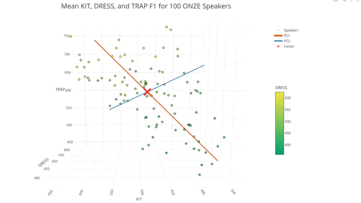
The plot above can be rotated with the mouse and the legend on the right allows for different plot elements to be turned off. Double click ‘Speakers’ to see just the points for each speaker.
What are these elements?
- The points are the mean first formant values for dress, trap, and kit for 100 speakers from the Origins of New Zealand English (ONZE) corpus.
- The ‘Center’ is the centre of the cloud of points.
- PC1 shows the first principal component derived from the data.
- PC2 shows the second principal component.
The idea here is to explain PCA in three dimensions as putting a cross in the centre of a cloud of points and then drawing the straight line which captures the most variation in the data. That is, to draw the straight line which is ‘inside’ the cloud of points for as much of its length as possible. We then create the second PC, by finding the line at right angles to the first line which captures the most possible variance.
The data can then be plotted against these two lines rather than the original three dimensions and the same idea extends to cases when we have many many more variables than three.
Ideally, the principal components are interpretable. In this case, the first PC is a line from small values of all three variables to large values. That is, we can interpret it as capturing something like vocal tract length. Speakers with long vocal tracts tend to have lower first formant values.
The second formant is also interpretable. The ONZE corpus contains speakers born in the mid-nineteenth century all the way through to the 1980’s. In this time, dress and trap have raised, while kit has lowered. The line for PC2 (the blue line), runs from high values of dress and trap and low values of kit to low values of dress and trap and high values of kit. That is, it captures the structure in our data which comes from the structured change in vowel spaces which has occurred over time in New Zealand English.
Lessons Learned
I have not found the plotly documentation for R to be very easy to get my head
into.
A few things which caused me trouble and might help you:
plotlyis not ‘surly’. Surliness is a feature of thetidyversepackages: they complain. If you add an argument to aplotlyfunction which it doesn’t recognise, it will often just ignore it without telling you. This is not great for people who like to use ‘colour’ rather than ‘color’ or ‘grey’ rather than ‘gray’.- Often an initial plot is made with
plot_ly()and then additional features are added to the plot withadd_trace(). In this case, the points are added to the plot at theplot_ly()stage, and the lines and the red cross added usingadd_trace(). The first argument toplot_ly()is a data frame, but this is not the case foradd_trace(). I have found being explicit by sayingdata = onze_to_pcarather than just havingplot_ly(onze_to_pca ...), avoids confusion. It took me a long time to work out why myadd_trace(onze_to_pca)was not functioning. - If the added element is different in
typefrom the original plot, it is vital to addinherit = FALSEto anyadd_trace()calls. My initial attempts to add lines to the plot added both lines and points (‘markers’ inplotlyspeak) because I failed to addinherit = FALSE. - Axis labelling for 3D plots occurs by modifying the
scenerather thanxaxisoryaxisetc. directly. See the call tolayout()in the plot code.
It may be that there are obvious solutions to some of these problems. If so, please let me know!
Joshua Wilson Black
Lecturer
My research spans philosophy, linguistics, data science, and digital humanities. In all these fields, I seek insight into sign use and how it fits in to our picture of the wider world.